
Colour drenching — painting walls, trim, ceiling and even the woodwork in one continuous shade — is one of the biggest interior trends of the past few years. Done well, it makes a room feel enveloping, cohesive and expensive. Done badly, it can make a space feel flat, murky or unfinished. Before you pick up a roller, here are the colour drenching mistakes we see most often, and how to sidestep them.

1. Skipping the sheen strategy
A common colour drenching mistake is using the same flat matte finish everywhere. Without variation in sheen, the room can look one-dimensional under changing light. The trick professionals use is to shift sheen by surface: matte or eggshell on walls, a soft satin on trim and woodwork, and something with a touch more sheen on the ceiling to bounce light around. The colour stays constant, but the finish does the work of adding depth.
2. Not testing the colour in the room's actual light
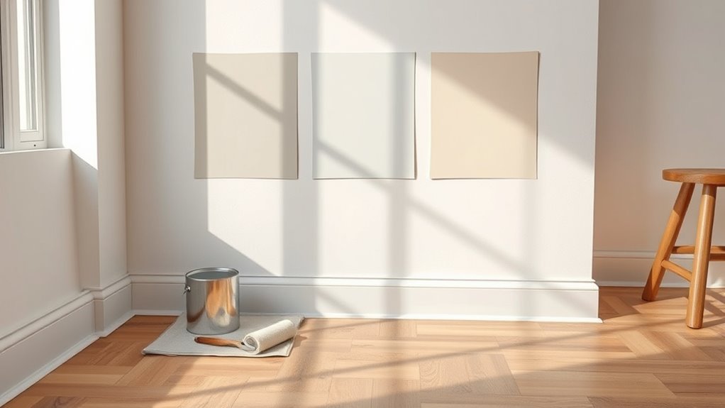
Colour drenching amplifies whatever undertones are in your paint — so a shade that looked perfect on a swatch card under shop lighting can shift dramatically once it covers every surface in your own room. Test a large sample (at least A2 size) on two or three walls and check it morning, afternoon and evening before committing.
3. Forgetting the "in-between" details
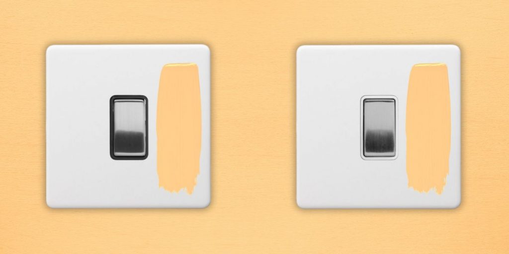
This is the mistake that undoes colour drenching more than any other. People carefully paint the walls, skirting boards, architrave and even the ceiling — then leave radiators, door handles, and light switches and sockets in stock white. The eye goes straight to the one thing that breaks the colour, and the whole effect looks unfinished rather than intentional. If you're drenching a room, plan for every fixed element to be considered, including switch plates and sockets — which is exactly why colour-matched options (like our Hague Blue range) exist, so you're not left painting around plastic fittings or living with a jarring white rectangle on a drenched wall.
5. Painting the ceiling a flat white "to keep it light"
Leaving the ceiling white while drenching the walls is one of the most common half-measures. It breaks the sense of envelopment that makes colour drenching feel intentional, and it can actually make ceilings look lower by drawing a hard line across the room. Carrying the colour up and across the ceiling (even at a slightly lighter tint) keeps the eye moving smoothly around the space.

6. Getting the painting order wrong
Colour drenching involves far more surfaces than a standard wall repaint, so sequencing matters. Painting skirting boards and trim before the walls (rather than after) tends to leave cleaner lines, since it's easier to cut in wall colour against finished woodwork than the reverse. Rushing this — or trying to do walls, trim and ceiling all in one pass — is where most uneven, patchy results come from.
7. Ignoring how the room connects to the next one
A drenched room can look stunning in isolation and jarring the moment a door opens into a hallway or adjoining room in a completely different colour. Consider sightlines from the room into the rest of your home — even a shared trim colour or a complementary tone in the next space keeps the transition intentional rather than abrupt.
Getting colour drenching right, down to the last detail
Colour drenching is meant to feel deliberate and cohesive — which means every surface, including your switches and sockets, needs to be part of the plan rather than an afterthought. Browse our colour-matched switches and sockets to finish your drenched room properly, right down to the last plug socket.